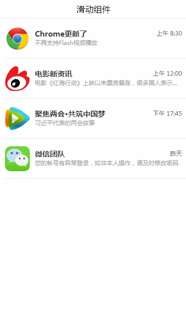
移动端---左滑删除组件
实现思路
具体实现思路如下:
具体实现
Html代码
?
1
2
3
4
5
6
7
8
9
10
11
12
13
14
15
16
<div class="container">
<div class="page-title">滑动组件div>
<ul>
<li class="list-item " v-for="(item,index) in list " data-type="0">
<div class="list-box" @touchstart.capture="touchStart" @touchend.capture="touchEnd" @click="skip">
<img class="list-img" :src="item.imgUrl" alt="">
<div class="list-content">
<p class="title">{{item.title}}p>
<p class="tips">{{item.tips}}p>
<p class="time">{{item.time}}p>
div>
div>
<div class="delete" @click="deleteItem" :data-index="index">删除div>
li>
ul>
div>
注意:我这里的数据全是本地 mock 的~
Css样式代码
?
1
2
3
4
5
6
7
8
9
10
11
12
13
14
15
16
17
18
19
20
21
22
23
24
25
26
27
28
29
30
31
32
33
34
35
36
37
38
39
40
41
42
43
44
45
46
47
48
49
50
51
52
53
54
55
56
57
58
59
60
61
62
63
64
65
66
67
68
69
70
71
72
73
74
75
76
77
78
79
80
81
82
83
84
85
86
87
88
89
90
91
92
93
94
95
96
97
98
99
100
101
102
103
104
105
106
107
108
109
110
111
112
113
114
115
.page-title{
text-align: center;
font-size: 17px;
padding: 10px 15px;
position: relative;
}
.page-title:after{
content: " ";
position: absolute;
left: 0;
bottom: 0;
right: 0;
height: 1px;
border-bottom: 1px solid #ccc;
color: #ccc;
-webkit-transform-origin: 0 100%;
transform-origin: 0 100%;
-webkit-transform: scaleY(0.5);
transform: scaleY(0.5);
z-index: 2;
}
.list-item{
position: relative;
height: 1.6rem;
-webkit-transition: all 0.2s;
transition: all 0.2s;
}
.list-item[data-type="0"]{
transform: translate3d(0,0,0);
}
.list-item[data-type="1"]{
transform: translate3d(-2rem,0,0);
}
.list-item:after{
content: " ";
position: absolute;
left: 0.2rem;
bottom: 0;
right: 0;
height: 1px;
border-bottom: 1px solid #ccc;
color: #ccc;
-webkit-transform-origin: 0 100%;
transform-origin: 0 100%;
-webkit-transform: scaleY(0.5);
transform: scaleY(0.5);
z-index: 2;
}
.list-box{
padding: 0.2rem;
background: #fff;
display: flex;
align-items: center;
-webkit-box-sizing: border-box;
box-sizing: border-box;
justify-content: flex-end;
position: absolute;
top: 0;
right: 0;
bottom: 0;
left: 0;
font-size: 0;
}
.list-item .list-img{
display: block;
width: 1rem;
height: 1rem;
}
.list-item .list-content{
padding: 0.1rem 0 0.1rem 0.2rem;
position: relative;
flex: 1;
flex-direction: column;
align-items: flex-start;
justify-content: center;
overflow: hidden;
}
.list-item .title{
display: block;
color: #333;
overflow: hidden;
font-size: 15px;
font-weight: bold;
text-overflow: ellipsis;
white-space: nowrap;
}
.list-item .tips{
display: block;
overflow: hidden;
font-size: 12px;
color: #999;
line-height: 20px;
text-overflow: ellipsis;
white-space: nowrap;
}
.list-item .time{
display: block;
font-size: 12px;
position: absolute;
right: 0;
top: 0.1rem;
color: #666;
}
.list-item .delete{
width: 2rem;
height: 1.6rem;
background: #ff4949;
font-size: 17px;
color: #fff;
text-align: center;
line-height: 1.6rem;
position: absolute;
top:0;
right: -2rem;
}
这是核心的样式代码
微信公号搜索:遇见一朵小花。(或扫描二维码)找我玩啊只讲对你有用的东西。
也常常给粉丝寄出自己看完闲置的好书,喜欢看书的可以来看看,
还不定期在公众号请大家喝奶茶!
想与我聊聊或者有什么问题都可以在公众号找到我。
等你哟~

标签:
相关文章
-
无相关信息