php 三列页面布局,CSS如何实现三列布局?实现三列布局的3种方法(代码示例)...
本篇文章给大家带来的内容是介绍CSS如何实现三列布局?实现三列布局的3种方法(代码示例)。有一定的参考价值,有需要的朋友可以参考一下,希望对你们有所帮助。
三列布局指的是两边两列定宽,中间的宽度自适应。
常用三种方法:定位
浮动
弹性盒布局
定位方式
最直观和容易理解的一种方法,左右两栏选择绝对定位,固定于页面的两侧,中间的主体选择用margin确定位置
定位方法创建三列布局*{
margin: 0;
padding: 0;
}
.left{
width: 200px;
height: 500px;
background-color: yellow;
position: absolute; /* 绝对定位,使位置固定 */
left: 0;
top: 0;
}
.center{
height: 600px;
background-color: purple;
margin: 0 300px 0 200px; /* 通过外边距确定宽度 */
}
.right{
width: 300px;
height: 500px;
background-color: red;
position: absolute; /* 绝对定位,使位置固定 */
right: 0;
top: 0;
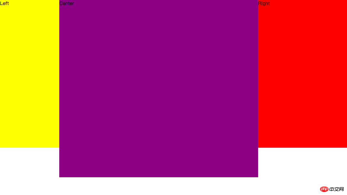
}
Left Center Right结果
浮动方法
让左右两边部分浮动,脱离文档流后对中间部分使用margin来自适应
浮动法创建三列布局*{
margin: 0;
padding: 0;
}
.left{
width: 200px;
height: 500px;
background-color: yellow;
float: left;
}
.center{
height: 600px;
background-color: purple;
margin: 0 300px 0 200px;
min-width: 100px; /* 最小宽度,防止浏览器缩小后中间部分被隐藏 */
}
.right{
width: 300px;
height: 500px;
background-color: red;
float: right;
}
Left Right Center弹性盒布局
使用容器包裹三栏,并将容器的display设置为flex,左右两部分宽度设置为固定,中间flex设置为1,左右两边的值固定,所以中间的自适应
弹性盒子创建三列布局*{
margin: 0;
padding: 0;
}
.container{
display: flex;
}
.left{
width: 200px;
height: 500px;
background-color: yellow;
}
.center{
height: 600px;
flex: 1;
background-color: purple;
}
.right{
width: 300px;
height: 500px;
background-color: red;
}
Left Center Right标签:
相关文章
-
无相关信息